Case Study: Quantifying Design Impact for Strategic Rebranding
Overview
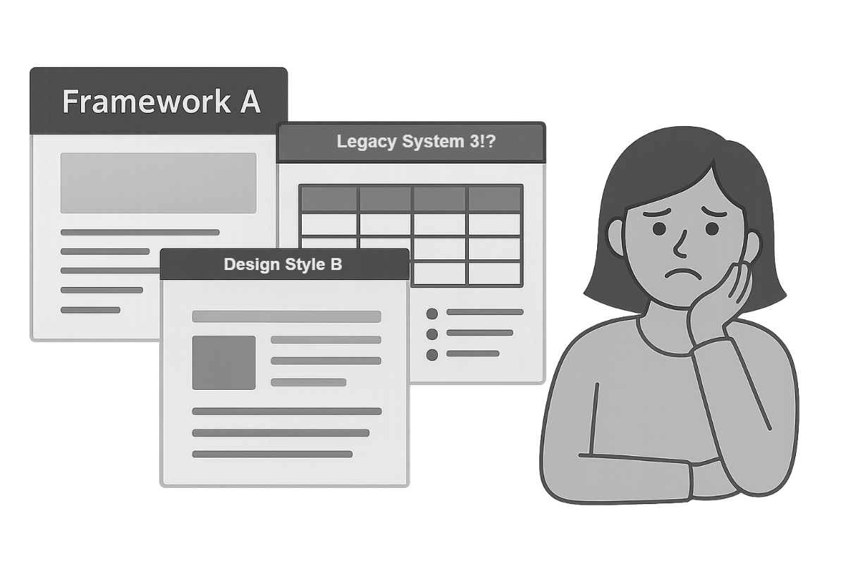
Our platform had grown over almost two decades of development, serving diverse client sectors and evolving through numerous frameworks, design systems, and technical stacks. While our design team was positioned to influence the future direction of the product, the existing interface was fragmented, outdated, and inconsistent across modules. We needed to modernize.
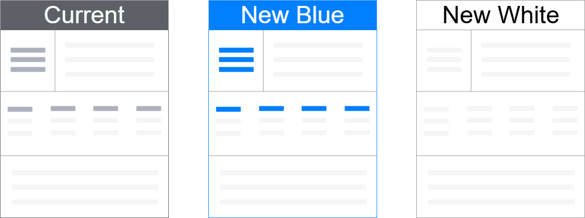
But visual refreshes are costly, especially at enterprise scale. With Marketing advancing a rebrand and our design team developing two new visual directions ("New Blue" and "New White"), we needed to assess whether the investment in updating the UI across the platform would be justified by meaningful impact.
- My Role: Lead UX Researcher
- Scope: Research Design, Study Execution, Data Analysis, Strategic Recommendation
- Impact: Data-informed decision for product-wide UI refresh, aligned with brand and user needs
The Challenge
The visual and technical inconsistencies across our platform were significant. Many screens were built on legacy codebases, and styling conventions varied widely, not just between modules but sometimes within the same user flow.
The challenge wasn't simply one of aesthetics. Rebuilding the product to align with a modern brand and design system would require:
- Reworking legacy architecture
- Aligning stakeholders across business units
- Justifying large-scale resource allocation
This was a design refresh with real budget implications. And despite strong enthusiasm for the new designs, I recognized the need for objective data to guide the decision.
My Approach
1. Research Framework
I structured the research around two central questions:
- Which design direction best aligns with the attributes our product teams and brand want to project?
- Which design do users actually prefer?
To answer these, I designed a mixed-methods study with a strong quantitative foundation. This included:
- 5-second impression tests for first-glance perception
- Desirability testing (using semantic differential scales)
- Preference testing
While most data was quantitative, we also asked participants to share short-form feedback during the tests, which provided valuable qualitative context alongside the numeric trends.
This project spanned multiple teams, including Marketing, Product, Design, and Legal, and each group brought its own priorities to the rebranding effort. Marketing was focused on brand alignment and visibility, while the design team was motivated by the opportunity to modernize the interface. Product managers, however, were caught in the middle. Many were excited about the new visual direction, but those responsible for legacy pages were understandably hesitant. Updating older modules came with significant cost and complexity.
Rather than treat that hesitation as resistance, I engaged with PMs directly to understand what success would look like from their point of view. What would make the investment worthwhile? What would help them feel confident bringing these changes into their domain? These conversations helped shape how we framed the ROI of the redesign and ensured that the research addressed their operational concerns, not just aesthetic or branding goals. That alignment proved critical to securing support across the organization.
2. Establishing the Right Criteria
Before testing, I needed a valid set of product and brand attributes to assess. I conducted an internal survey with product managers, asking them to identify:
- Words they wanted their product to be associated with
- Words they wanted to avoid
I combined those responses with Marketing's brand guidelines to build a refined set of semantic word pairs:
- Outdated – Modern
- Overwhelming – Open
- Inconsistent – Consistent
- Complicated – Easy-to-use
- Dull – Attractive
- Amateur – Professional
- Complex – Approachable
- Boring – Dynamic
- Counterintuitive – Intuitive
3. Study Design & Participants
I used UsabilityHub (now Lyssna) to structure six test variants across three design styles: the current design, New Blue, and New White.
Each participant completed:
- One 5-second test (first impression) on a mockup
- Nine semantic differential scale ratings (desirability)
- One direct preference test (A/B comparison)
Because this study involved unreleased brand directions and high-visibility design work, we made a cross-functional decision to conduct it anonymously. This wasn't a single stakeholder mandate. It emerged gradually across conversations with Product, Marketing, and Legal. I took the initiative to suggest formalizing the approach, and the idea was well received.
Of course, testing brand perception without revealing your actual brand introduces some complexity. To solve this, I partnered with our design system team. They took real product pages and recreated them using anonymized design assets, including a fictitious logo and realistic but generic data. Even our "current" design version was visually stripped of brand identifiers to maintain consistency across variants.
On the operations side, I worked with Legal to craft an NDA that preserved confidentiality without disclosing our company name. We also used platform features within the testing tool to further protect our identity during recruitment and participation. While brand recognition often helps with engagement, in this case, anonymity was the right call. It allowed us to gather honest, unbiased feedback without revealing strategic design work ahead of Marketing's formal launch.
We recruited a balanced sample of 49 participants:
- 24 internal users (Chatham advisors and power users)
- 25 external users, recruited through Respondent.io with criteria including:
- U.S.-based, English-speaking
- Bachelor's degree or higher
- Financial services or commercial real estate background
- Titles such as Financial Analyst, Asset Manager, CFO, or Capital Markets Analyst
Because we were unable to involve real clients in this study, I turned to third-party recruitment through Respondent.io. It was my first time using the platform, and I collaborated with a few product managers to define a screener and participant criteria that would yield representative, though not direct, equivalents to our target personas.
What I hadn't anticipated was the volume of low-quality or fraudulent responses that flooded in. While my screener questions were designed for relevance, I began noticing suspicious patterns. Several participants submitted near-identical answers. A quick search revealed that some had likely copied directly from public sources like Investopedia. It became clear that I needed to adjust my approach.
I quickly implemented a secondary review process. This included spot-checking participant details, reviewing response consistency, and, in some cases, following up directly with clarification questions. To mitigate personal bias, I documented the review criteria and had it validated by others. It wasn't a perfect system, but it helped ensure the data I collected was reliable and grounded in meaningful user input.
Thankfully, Respondent.io has since made significant improvements to fraud detection. While that initial experience was bumpy, it pushed me to be more rigorous and adaptive in how I think about third-party recruitment, and I've returned to the platform successfully for multiple projects since.
Results & Impact
The study yielded both quantitative metrics and open-ended responses, offering insight into how design choices influenced perception and user sentiment.
Desirability Testing
Across all nine attribute pairs, the New White design scored highest. This was particularly true for traits such as:
- Modern
- Attractive
- Approachable
Preference Testing
When shown side-by-side, New Blue designs were preferred slightly more by participants, particularly among external users, who responded positively to its stronger visual presence and bold color treatment. Internal users leaned more neutral, with some expressing a preference for the cleaner feel of the New White version.
The results clearly showed that both of the proposed redesigns outperformed the current experience in measurable ways. My recommendation was not to pick a specific design, but to move forward with a modernized interface, because the data supported doing so. I concluded that both New White and New Blue met the project's objectives and would serve the product and brand well.
I presented the findings with confidence, highlighting the nuanced differences between the two options. I also helped take the results on a roadshow to bring visibility to the effort and build broader stakeholder buy-in.
That collaboration ultimately led to the selection of the New White design for implementation.
Reflections
This project reminded me that great design only matters when it serves a clear purpose. I personally preferred the new designs and was excited about the idea of a visual refresh. But I entered the work prepared to recommend against the update if the data didn't support it.
Through structured testing, we confirmed that the new design was not just more attractive. It was more aligned with user expectations, better associated with the brand's intended attributes, and a stronger fit for where the product was headed.
The study provided a clear, data-informed basis for the decision to proceed with the New White design. It also highlighted the importance of aligning research with business goals and stakeholder needs, ensuring that the final recommendation served the business, not just aesthetic preferences.