Case Study: Treatment Management Redesign – Hedge Accounting Workflow
Overview
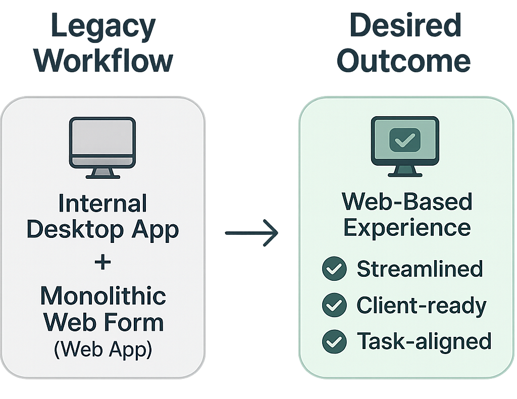
Our hedge accounting tools were fragmented, internally siloed, and inefficient for users. The experience relied on two disconnected systems: one was a legacy desktop tool, and both forced users through long, error-prone forms with limited visibility.
We needed to centralize the functionality into a client-accessible web experience while simplifying the process for internal accountants navigating complex workflows.
- My Role: Lead UX Designer embedded with the Hedge Accounting team
- Scope: Discovery, Research, UX Design, Iteration, Stakeholder Collaboration
- Impact: Streamlined internal workflows, enabled client-facing capabilities, reduced overtime stress at period end
The Challenge
Hedge accounting is infamously complex, and even seasoned accountants often struggle with the domain at first. Our internal accounting advisors worked across two tools:
- An internal-only desktop application
- A web-based app that was essentially a massive, monolithic form
These tools were:
- Not client-ready
- Error-prone due to their complexity
- Visually overwhelming and poorly aligned with actual workflows
Our goal was twofold:
- Unify the experience into a single web-based tool
- Enable future external (client) use by reimagining the experience for clarity and self-service
My Approach
1. Learn the Domain, Understand the Workflow
- Conducted 1:1 interviews and observation sessions with internal accountants and SMEs
- Shadowed workflows to understand pain points, decision paths, and data dependencies
- Prioritized internal users as proxies for future client needs
We hire experienced accountants, and even they need to relearn everything for hedge accounting. – Internal SME
2. Design Iteratively and Independently
- Created both low- and high-fidelity prototypes
- Conducted informal feedback loops: reverse demos, test sessions, live walkthroughs
- Adjusted constantly based on input from users and dev constraints
Prototypes evolved in tandem with business priorities, and I maintained ongoing collaboration with the five-person dev team and our product leads.
One of the most eye-opening moments came during usability testing, when I noticed an accountant switch away from an early build to open Excel. Curious, I asked what they were doing. They were manually stepping out of the tool to rework simple math the system had already calculated, just to confirm it for themselves. The system now handled the math automatically, but they didn't fully trust it yet.
And then I saw it again. And again. I was amazed to see accountant after accountant exhibit the same behavior, each independently stopping to verify the system's math with their own spreadsheet. This wasn't a one-off. It was a recurring signal of a deeper trust issue.
From a design standpoint, the calculation was clutter. It took up space, added noise, and technically wasn't necessary. But from the user's perspective, it was a confidence gap. Instead of fighting that, I collaborated with the development team to display the math explicitly within the workflow, even though it was functionally redundant. The calculation's inclusion reduced friction and saved users from context-switching out to Excel.
We implemented it with foresight: the feature was modular, so it could be easily removed once users were confident in the system. And eventually, that's exactly what happened. As trust grew, the manual reassurance became obsolete, and we quietly removed it without disruption. It was a rare moment of adding "intentional noise" to deliver real clarity.
In early design sessions, I leaned heavily on our internal accountants to understand which data fields mattered most. But it became clear that they were responding from their perspective as deep-domain advisors, not necessarily as proxies for our future client users. To bridge that gap, I partnered closely with our product manager, who brought firsthand hedge accounting experience and business strategy insight. Together, we mapped out which workflows and data points were essential for clients to self-serve effectively. Their needs were simpler and more focused than our internal teams', and isolating that core subset of functionality helped us surface the right information with clarity and intent.
3. Rollout with Real Feedback Loops
- Hosted early adoption sessions to surface usability issues
- Facilitated team walkthroughs as adoption increased
- Supported the team in adjusting and refining live features based on real usage
Early versions lacked full parity with legacy tools, but internal users began shifting over because the redesigned experience reduced friction and surfaced the most critical information clearly.
During early workflow design, I intentionally built in an auto-save feature that recorded changes instantly, without requiring users to click "Next" or manually save. Based on my research, this helped support a key use case: accountants who needed to make quick, one-off updates to existing treatments without walking through the full wizard or risking lost work. It also prevented issues with abandoned tabs or unsaved sessions, which were common in the team's day-to-day habits.
Over time, I began receiving unsolicited feedback that highlighted an emerging issue. There was an important use case I hadn't observed and that users hadn't mentioned earlier: some accountants used the treatment tool as a kind of sandbox during client advisory work. They would experiment with changes, model "what if" scenarios, and explore outcomes before offering guidance. But with auto-save on, those hypothetical changes were being written directly to live data, overwriting real treatment records.
It was a classic case of good intentions clashing with real-world complexity. We couldn't build a full sandbox mode due to system constraints, so I collaborated with the dev team to pivot: we removed auto-save and implemented manual save controls instead. It was a small shift that gave users back control, and more importantly, it protected data integrity while supporting their actual workflows.
Results & Impact
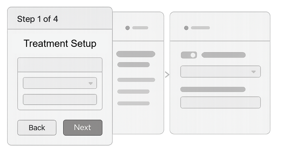
The final experience became a four-step guided wizard within our main client-facing web platform.
- FrameworkCaptured the overall structure of the treatment, including hedge designation, accounting standard, dates, and percentages.
- P&L MethodGathered key profit and loss details and included a robust OCI release mechanism with scheduling tools and reusable templates.
- AssessmentFocused on the evaluation of hypothetical derivatives, covering prospective and retrospective methods, regression details, and mismatch explanations.
- SettingsHandled process-level controls such as journal entry automation, settlement tracking, and other operational preferences.
Key Outcomes
- Significantly reduced internal reliance on legacy tools
- Reduced cycle times at period close
- Laid foundation for future client-facing delivery of hedge workflows
We used to stay late at month-end. Now we're out by 8pm instead of midnight.
– Internal accounting advisor
Reflections
This project was a full application of design thinking in a high-trust, high-complexity environment.
I independently led research, ideation, and iteration in a challenging domain, helping drive cross-functional trust in UX by delivering fast, user-centered results. It also reinforced the value of designing for trust, not just accuracy. Sometimes, showing your work is more important than getting it right the first time. Most importantly, I helped people do difficult work with more ease and confidence.
This experience also reaffirmed the importance of staying close to end-user behavior, even deep into development. The trust we built came from relentless iteration and transparency, lessons I've continued to carry forward into every complex system I've worked on since.